ENERGY DRINK LABEL DESIGN FOR ICO/ISE PRODUCT PROMOTION
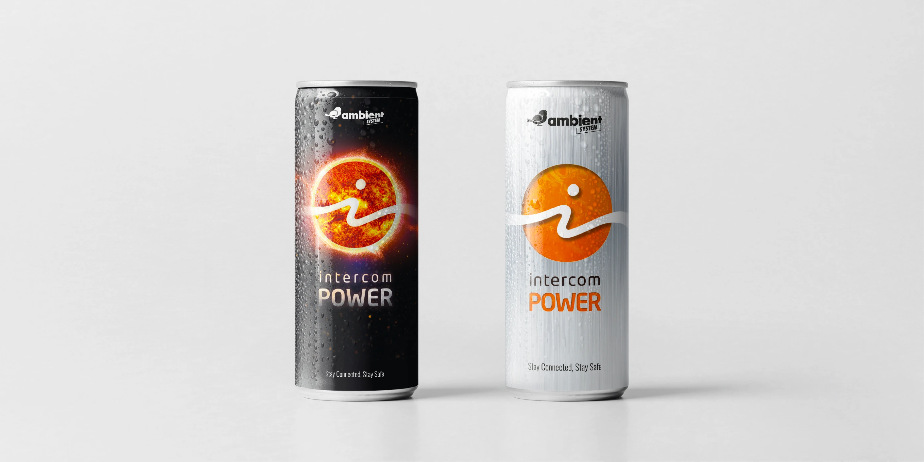
A trade show giveaway that works for brand recognition. Two editions of the Intercom Power label — last year's cosmic design and a refreshed variant for this year's trade show — promoting Ambient System's ICO and ISE intercom line.
Context
A Recognizable Trade Show Giveaway Across Two Events
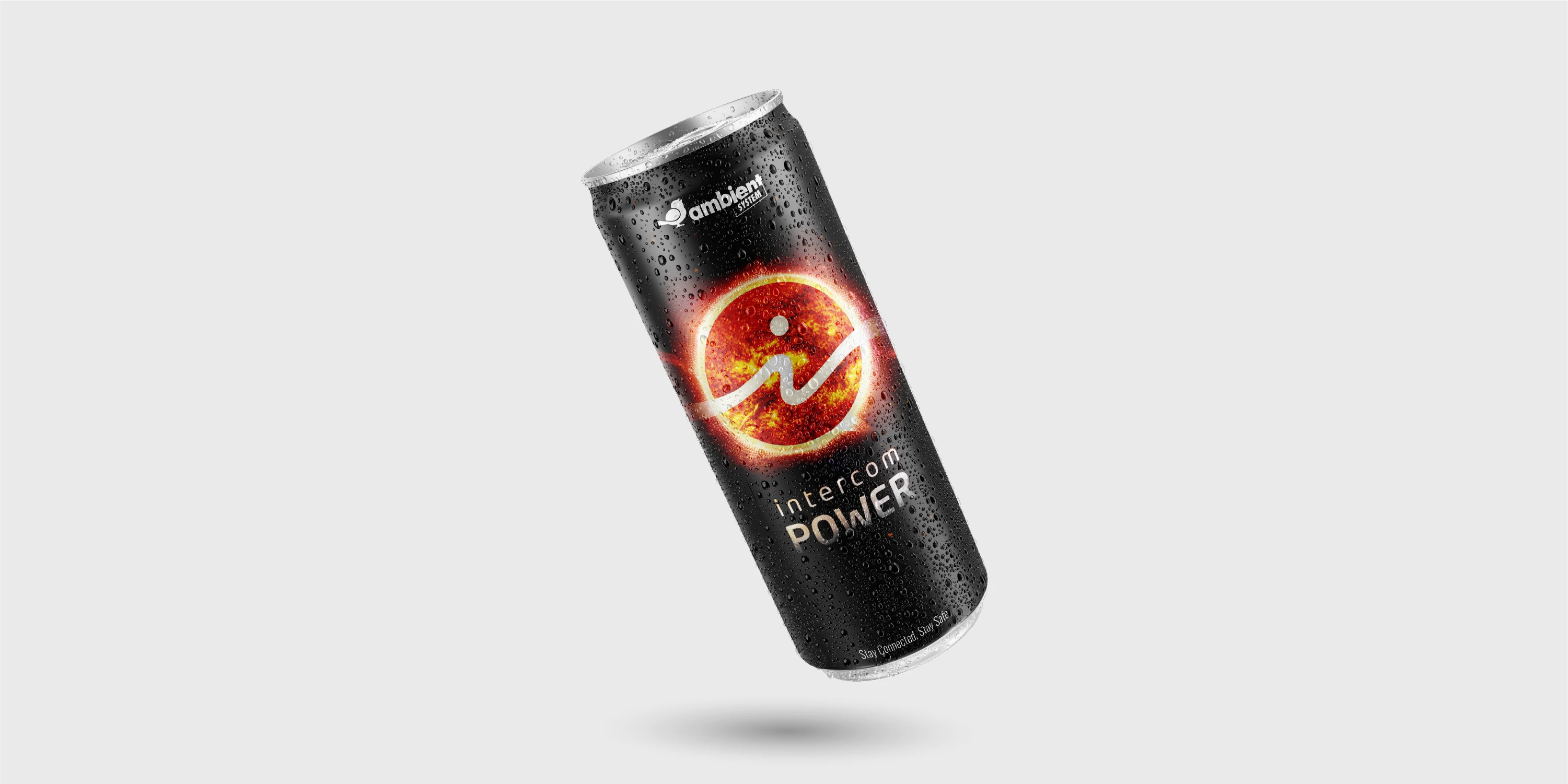
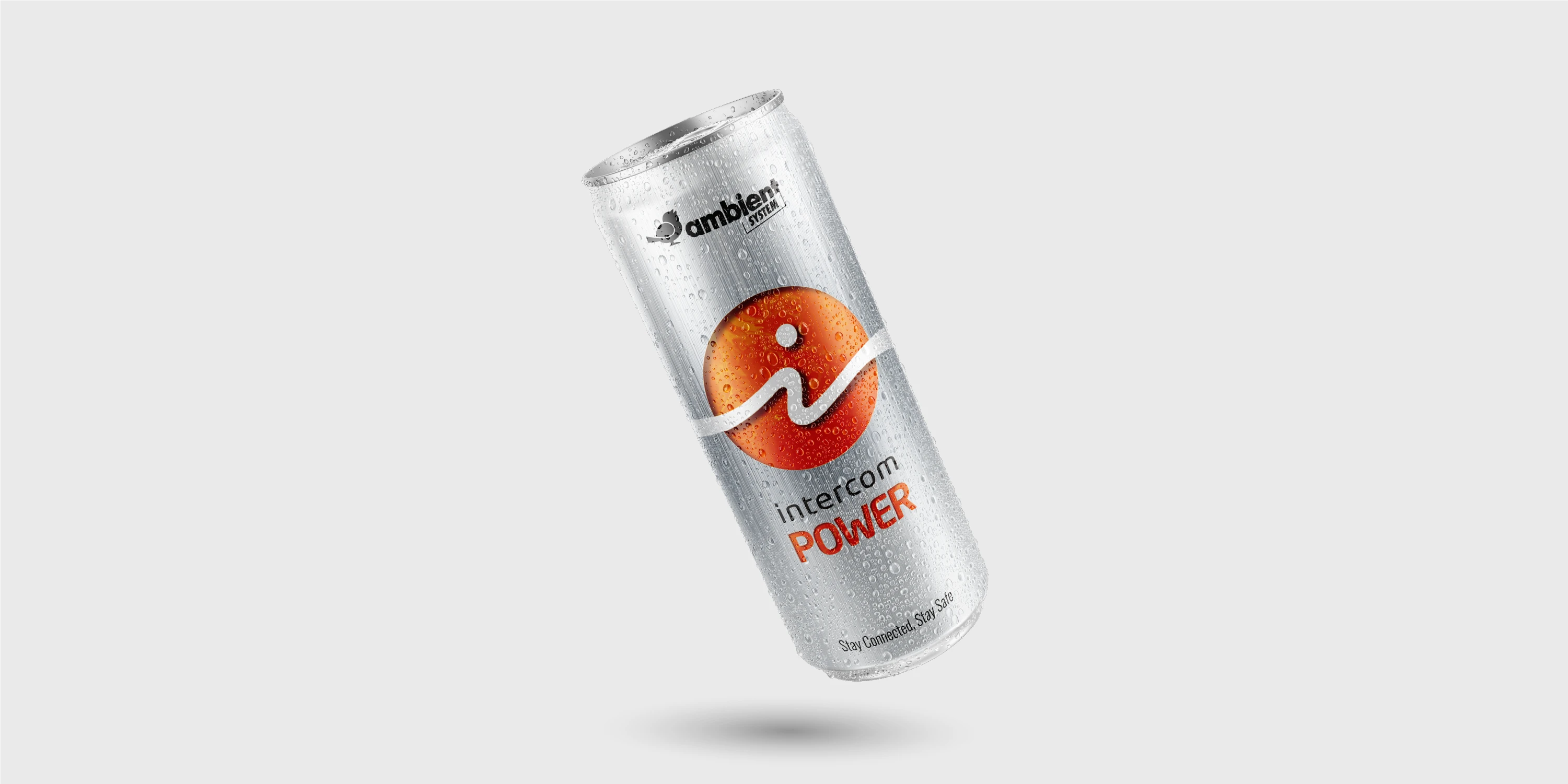
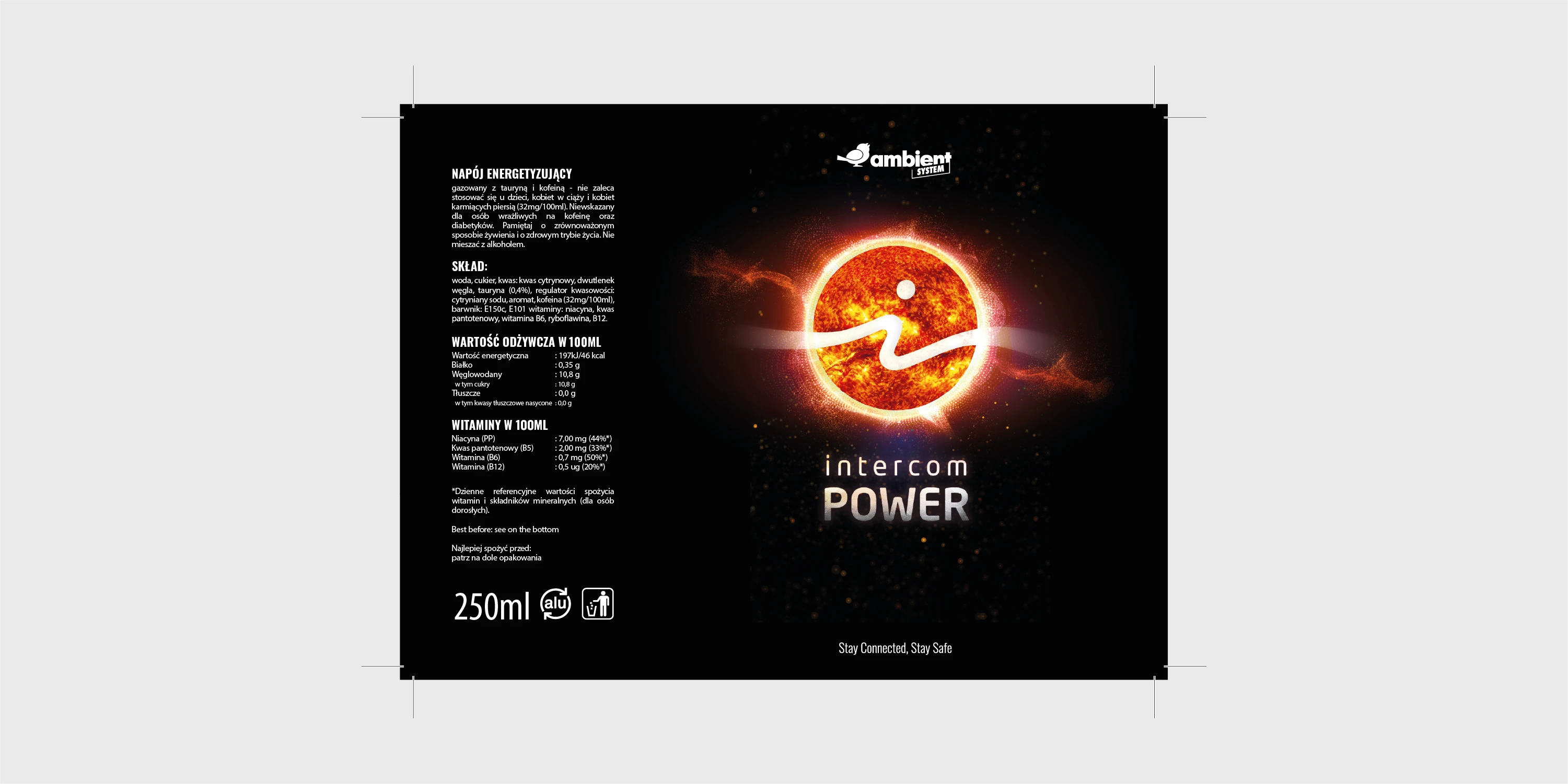
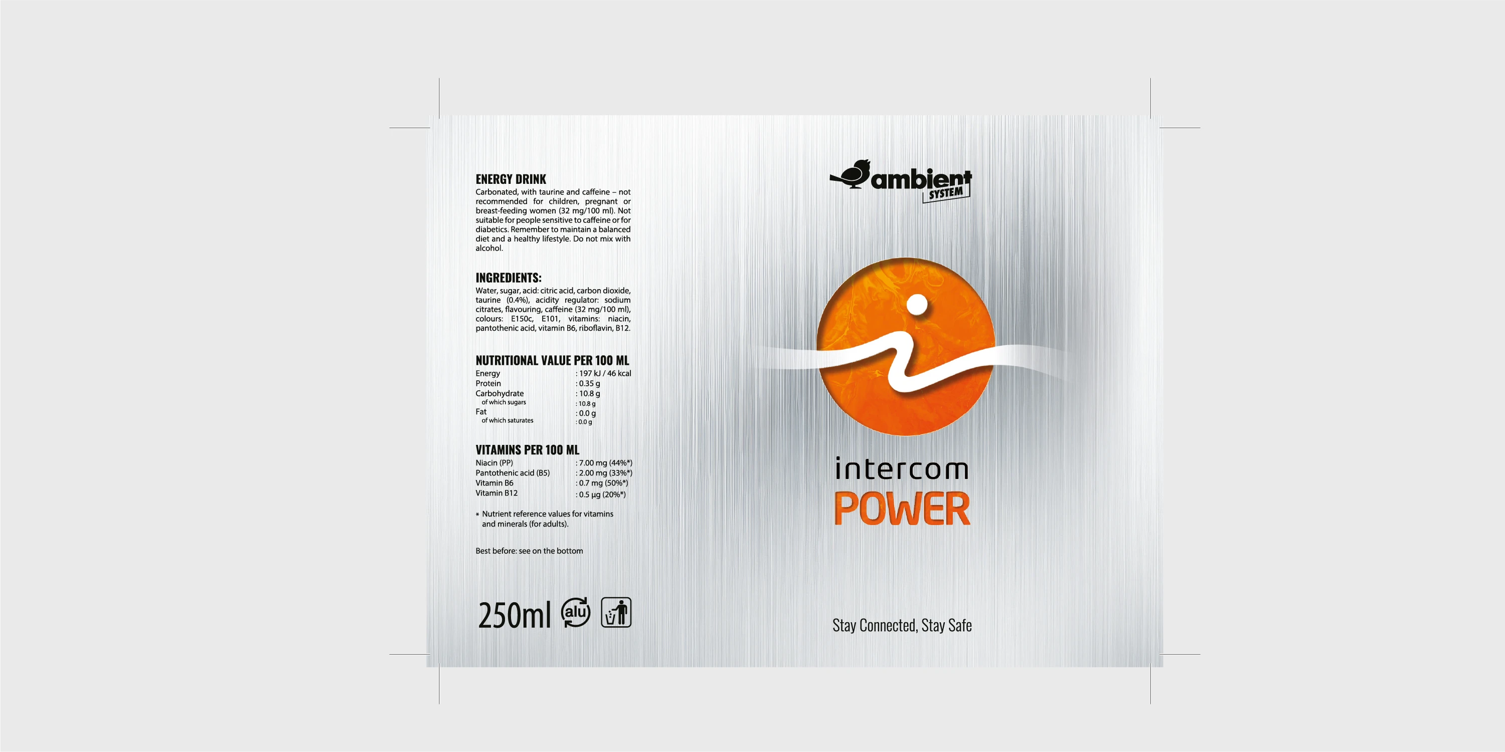
Ambient System promotes its ICO and ISE intercom device line at industry trade shows using an energy drink as an original giveaway distributed at its booth. I designed the first label version — in a dark, cosmic style referencing the brand's logo — the previous year. For this year's events, the company needed a refreshed variant that would preserve the product's brand recognition while introducing a lighter, more restrained character referencing the brushed aluminum finish found on ICO and ISE device housings.
Execution
Two Styles, One Cohesive Brand System
I designed both labels around the signature graphic mark of the ICO/ISE devices — an orange circle with the letter "i" — and a shared tagline, "Stay Connected, Stay Safe," reinforcing the brand's positioning. The first edition uses a dark, cosmic color scheme with a glowing, atmospheric depth effect; this year's version uses a bright, silver background with orange accents, giving it a lighter, more contemporary feel. I optimized both labels for wraparound printing on a cylindrical can — a full 360° layout.
Result
A Consistent Visual Identity Across Trade Show Editions
The Intercom Power labels have become a recognizable part of Ambient System's presence at industry trade shows — booth visitors naturally associate them with the ICO and ISE intercom device line. Keeping the graphic mark consistent while refreshing the styling allowed the brand to maintain visual continuity across event editions, steadily building recognition for its products.
Have an idea for a project?
For over 8 years, I've been helping companies with visual communication and marketing for their products.