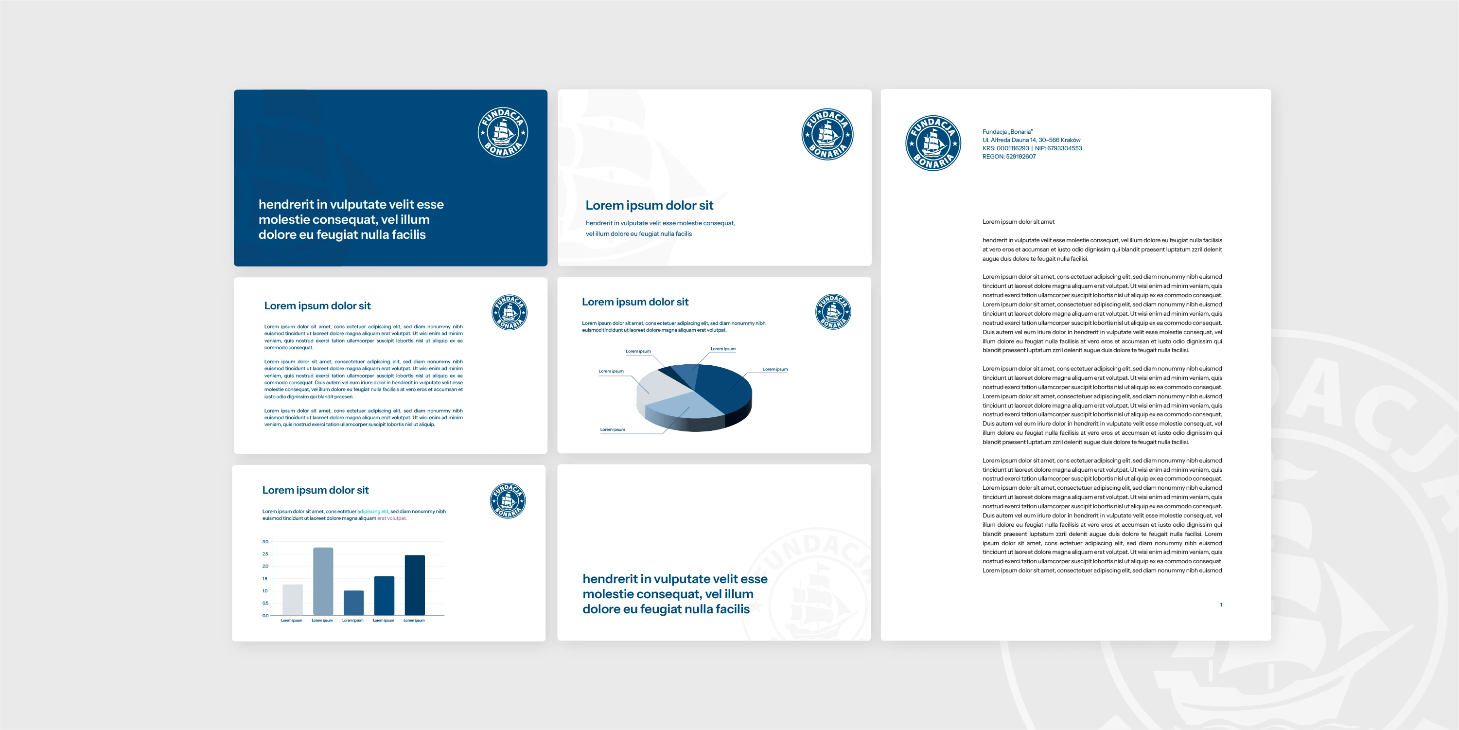
Visual identity elements for Bonaria Fundation
Fundacja Bonaria needed its letters, presentations and emails to look like they come from one organisation. I designed a letterhead, PowerPoint templates and an email signature, and chose the colours and typeface that tie them into one system.
Context
Everyday materials needed shared rules
Fundacja Bonaria communicates daily through letters, presentations and emails. These are produced by different people, so without shared rules, layouts, colours and fonts easily drift apart. My task was to bring them together in one set of ready-to-use elements the foundation can rely on every day.
Execution
Five elements, one visual system
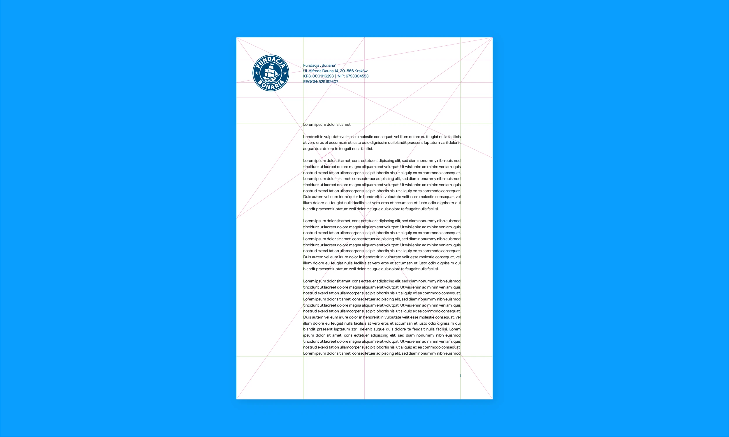
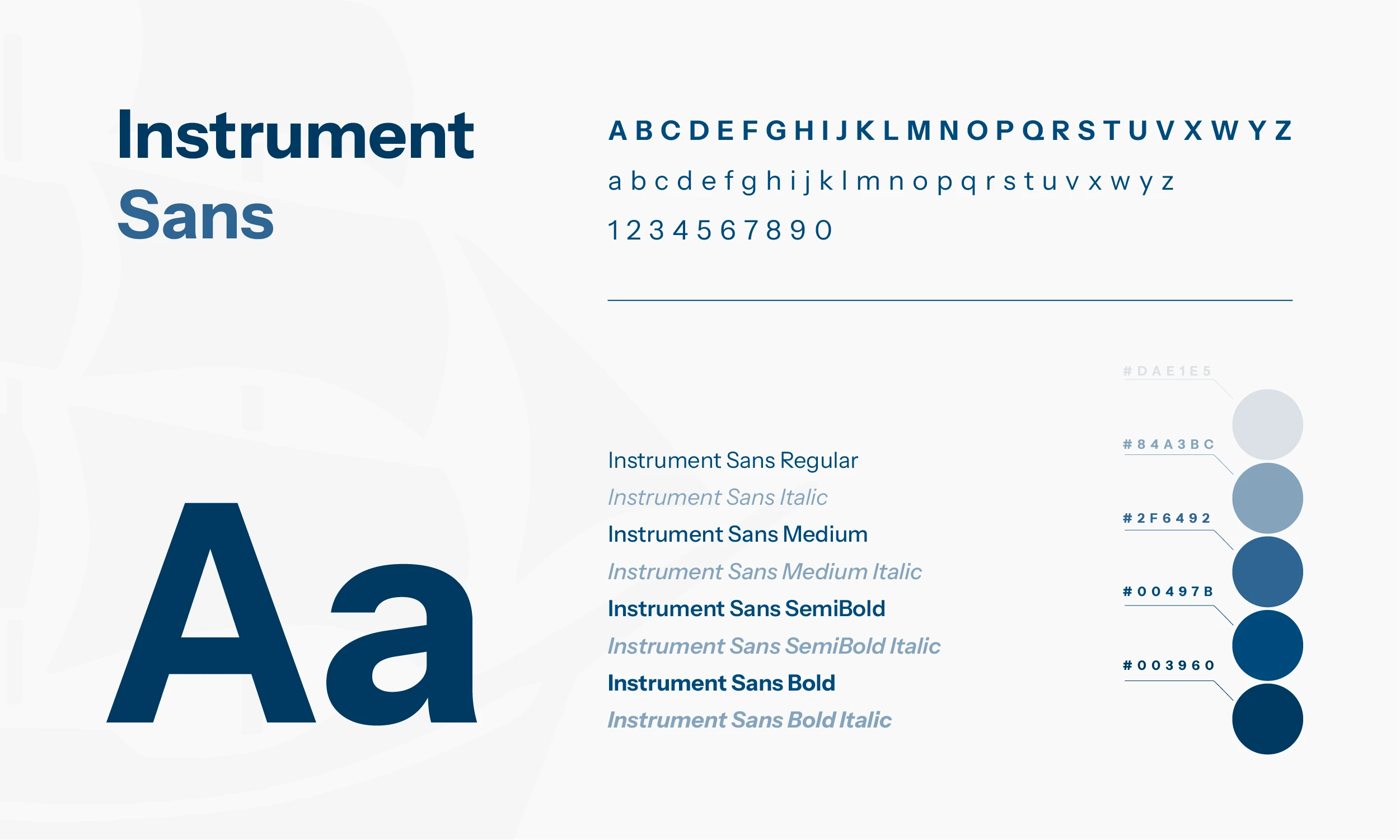
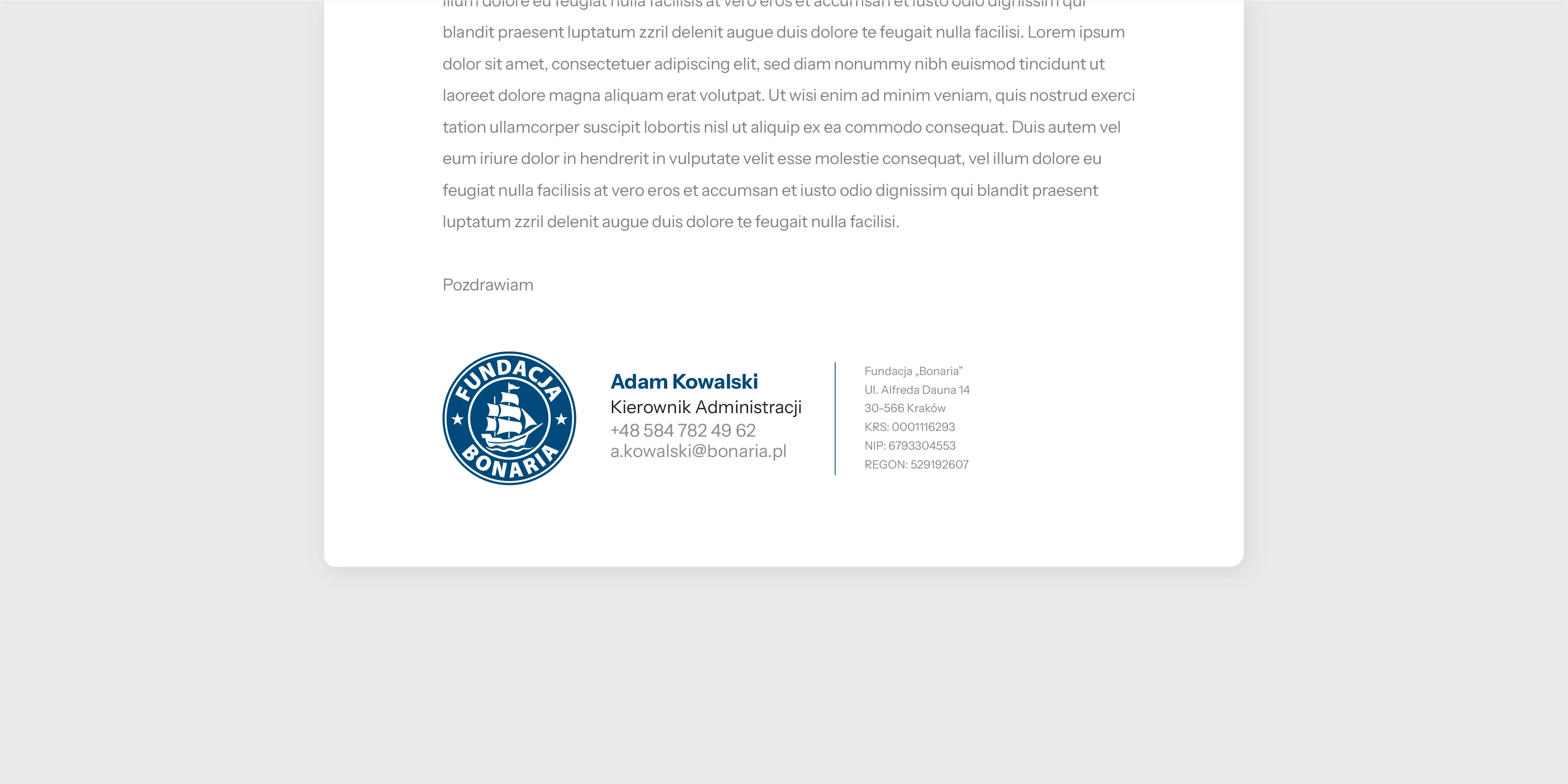
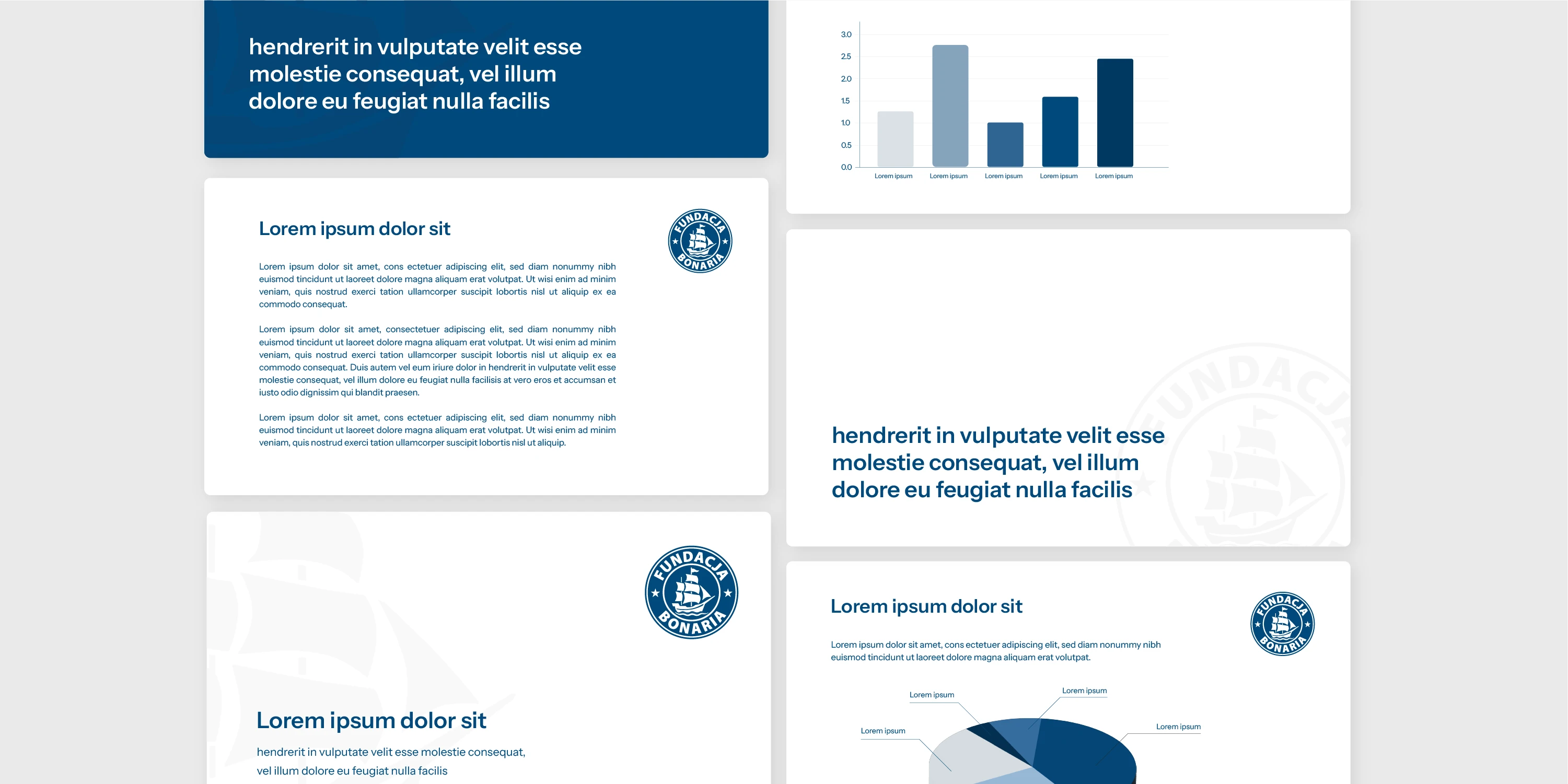
I started with a palette of five shades of blue, from a pale grey-blue #DAE1E5 to a deep navy #003960, and the Instrument Sans typeface: neutral, legible and free through Google Fonts. On that base I designed a letterhead with the registration details in the header and a grid-based layout, PowerPoint templates (title, text, chart and closing slides in the palette's colours) and an email signature, which I also built. Letters, presentations and emails now share the same layout and the same formal information.
Result
A consistent look across letters, presentations and emails
Fundacja Bonaria now has a complete set of materials built on one logo, one palette and one typeface. Letters, presentations and emails are instantly recognisable as the foundation's communication, whoever prepares them.
Have an idea for a project?
For over 8 years, I've been helping companies with visual communication and marketing for their products.